
Ashland Bottling Works
Ashland, WI

Columbia Brewing Co.
Shenandoah, PA

El Dorado Brewing Co.
Stockton, TX

Grand Island Brewing Co.
Grand Island, NE

Cerveceria Hondurena, S.A.
San Pedro Sula, Honduras

E. Porter Brewing Co.
Joliet, IL

Portland Brewing Co.
Portland, OR


Bellingham Bay Brewery
Whatcom, WA

Bucyrus Brewing Co.
Bucyrus, OH

Buffalo Brewing Co.
Sacramento, CA

Home Brewing Co.
Richmond, VA

Mt. Penn Brewing Co.
Reading, PA

Red Wing Brewing Co.
Red Wing, MN

J.M Spenard, Ltd.
Trois Riviere, Quebec, Canada

Ernst Tosetti Brewing Co.
Joliet, IL

Weisbrod & Hess Brewing Co.
Philadelphia, PA
The 'Stock' Exchange
American Art Works No. 128 "Join Me"
American Art Works No. 128 "Join Me"
Date: 1913 to 1917
Size: 13"
10.5" x 13.25"
13.25" x 13.25"
Type: Pie
Scarcity: Hard to Find
Value: $$$ to $$$$
Condition & Brewer Dependent
Size: 13"
10.5" x 13.25"
13.25" x 13.25"
Type: Pie
Scarcity: Hard to Find
Value: $$$ to $$$$
Condition & Brewer Dependent
.jpg "Freeland Brewing Co.")
Freeland Brewing Co.
Freeland, PA

Kamm & Schellinger Brewing Co.
Mishawaka, IN

Globe Beverage Co.
Chicago, IL

Trois Rivieres Own
Trois Rivieres, Toronto, Canada


General
No. 127 "Join Me" features another pretty lady and although she’s not quite as contemporary as No. 126 she is clearly no longer in the “Victorian Lady” category either. Although the pink rose she is wearing is a familiar adornment found in previous designs, the unique bit of her attire is the ornate headband she is wearing.
No. 127 "Join Me" features another pretty lady and although she’s not quite as contemporary as No. 126 she is clearly no longer in the “Victorian Lady” category either. Although the pink rose she is wearing is a familiar adornment found in previous designs, the unique bit of her attire is the ornate headband she is wearing.
Confirmed Brewer used Stock Trays
Non-Beer Related & Non-Tray Uses
Headbands began to gain popularity around 1910. Headbands at this time were made of luxury fabrics, and elements like decorative stitching or beads were often incorporated. Some headbands also came with combs, and some were made from a string of jewels. Headbands were often worn around hair that was pinned up. In the early 20th century, wide headbands known as headache bands were very popular accessories in women's fashion. Their name came from the belief that the tight pressure they provided around the forehead could relieve or prevent headaches.
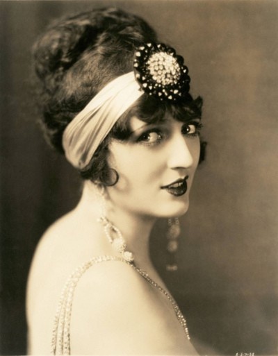
She is also wearing a pink rose which were generally are understood to symbolize grace and poise, and are associated with joy and happiness. Today it is generally associated with women but pink, it turns out, was not always a “girl color.” In the court of Louis XV, both woman and men’s outfits were pink when the color was extremely fashionable among both men and women of the aristocracy. Thus, the story of pink in Europe begins as a genderless color, associated with ideas of “elegance, novelty, and aristocratic splendor.” That started to change in the late-19th century Industrial Era, when men shifted to primarily donning black or other dark colors, while women continued to wear the rainbow.
We have never seen an example that carried a copyright date, just the © copyright symbol. Apparently, the requirement to print the date was dropped with the Copyright Act of 1909 (Pub.L. 60–349, 35 Stat. 1075, enacted March 4, 1909), a landmark statute in United States statutory copyright law which remained largely in effect until repealed and superseded by the Copyright Act of 1976. President Theodore Roosevelt expressed the need for a complete revision of copyright law as opposed to amendments, saying in a message to Congress in December 1905, "Our copyright laws urgently need revision. They are imperfect in definition, confused and inconsistent in expression; they omit provision for many articles which, under modern reproductive processes, are entitled to protection; they impose hardships upon the copyright proprietor which are not essential to the fair protection of the public; they are difficult for the courts to interpret and impossible for the Copyright Office to administer with satisfaction to the public.” In large part, his concern was driven by significant advancement in reproduction and duplication technology not adequately addressed by the then current copyright laws, as well as the emergence of material on new media such as pianola music roles, public performance of a musical composition, and motion pictures.
We have not encountered an example with an artist signature, but Sahling has a May 1913 entry in his workbook for “Stock Tray No. 128, Join Me.”
Size & Shape and Advertising Placement
We most frequently encounter this design as a small oblong (11x14) but also often as a concave pie as well. Far less common is a square version with a round image on it. The round versions of the image found on the pie and square versions crops the image a bit—there is less of her headband visible on these examples. There are also a few curled corner sign versions and we’ve also seen a round “unpressed tray” sign for a mineral water company. Rims are generally black with gold advertising text, although a few examples have a gold rim with black text. The Weisbrod & Hess example is the only one we are aware of with a logo printed on the face of the tray, while the Portland Brewing example has the only text we are aware of (positioned in the head of foam in the glass she is holding).
Hager & Price
Hager does not discuss this design nor is it identified in his date of introduction table although it is included in his catalog. We believe he didn’t include it in his date of introduction table because none of the examples we’ve seen have included a specific copyright date even though they have the stock number. This is likely due to a provision of the Copyright Act of 1909 which no longer required that the date be printed on the actual material (as Hager notes in his article). This design was popular with brewers and even includes one of few foreign uses of a stock design that we’ve seen (Cerveceria Hondurena, S.A.)
Click the Picture to Return to Meek & Beach Stock Catalog Page

