
American Brewing Co.
Detroit, MI

American Brewing Co.
Pekin, IL

Angeles Brewing & Malting Co.
Port Angeles, WA

Bellingham Bay Brewing Co.
Bellingham Bay, WA

Crescent Brewing Co.
Nampa, ID

El Dorado Brewing Co.
Stocton, CA

Humbolt Brewing Co.
Eureka, CA

Knapstein Brewing Co.
New London, WI

Pabst Brewing Co.
Milwaukee, WI

Petersen Brewing Co.
Grand Rapids, MI

E. Porter Brewing Co.
Joliet, IL

F.D. Radeke Brewing Co.
Kankakee, IL

Sayre Brewing Co., Ltd.
Sayre, PA

Star Union Brewing Co.
Peru, IL
The 'Stock' Exchange
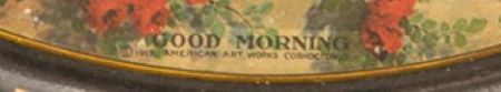
American Art Works: No. 132 "Good Morning"
American Art Works: No. 132 "Good Morning"
Date: 1913 to 1916
Size: 13"
Type: Pie
Scarcity: Common
Value: $$ to $$$$
Condition & Brewer Dependent
Size: 13"
Type: Pie
Scarcity: Common
Value: $$ to $$$$
Condition & Brewer Dependent

Stock
--

Allen's Ice Cream
??

Bakery & Confectionary Workers
International Union of America

Frank A. Brunke Liquors
Chicago, IL

Missoula Creamery Co.
Missoula, MT

Tennessee Cola
Unknow, TN

Nobelsville Milling Co.
Unknown


Sahling does not have an entry in his workbook for this design, nor have we seen any version with an artist’s signature. We can only assume that it was the work of one of Sahling’s colleagues at American Art Works.
Size, Shape & Advertising Placement
The vast majority of tray examples we’ve seen are concave pies; there are a few square examples with a round image. Interestingly, the Bakery & Confectionery Workers, International Union of America used both. We also have a recorded a single instance of a convex pie (Beich’s Chocolates). There are also a few examples of curled corner signs. Rims are usually black with gold advertising text, although a few have gold rims with black text.
Hager & Price
Hager does not discuss this design but includes it in his date of introduction table (1913) and in his catalog. Since this is a fairly common design, prices for brewery examples tend to be in the low to mid three figures. Non-brewery examples tend toward the mid-to-upper double figures or low three figures; however, a few examples did a little better than that. Surprisingly, an average condition curled corner sign from Lethbridge Brewing & Malting Co. Ltd. in Lethbridge Alberta Canada went for $2000.
Non-Beer Related & Non-Tray Uses
Confirmed Brewer used Stock Trays
General
The second design with the title “Good Morning”, No.132 seemingly represents something of a throwback compared with the increasingly contemporary feel of its immediate predecessor designs. Between the woman’s night bonnet and the Tudor design of the building, at first glance this appears to be a throw-back to a bygone English era (specifically the 16th century). However, the design may reflect a couple of interesting trends occurring at the end of the Edwardian era (1900-1910).
In the Victorian era, nightcaps were worn by all women, young and old. Usually made of cotton or wool, they were not very pretty, but were worn out of necessity because bedrooms were usually chilly. But by the beginning of the Edwardian era, they’d fallen out of favor, as homes increasingly had heating systems. However, as we’ve seen in several of the preceding designs there have been increasingly sophisticated women’s’ hairstyles. The elaborate pompadour coiffures of the later Edwardian era required curled hair and silk nightcaps not only made hair glossy, but also helped keep it tangle free. Nightcaps of the era look very similar to the bonnet the woman is wearing.
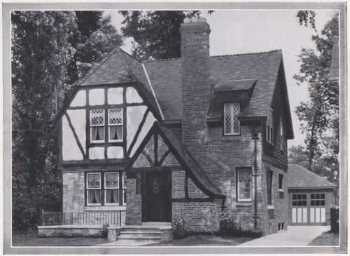
As for the Tudor design of the house, apparently there was a huge revival in older architectural styles in 1910s and 1920s with the Tudor style being particularly popular. English architecture had long influenced American taste from the colonial houses of New England and Virginia, through the Gothic Revivals of the 19th century. But never was Anglophilia more apparent than during the Tudor craze.
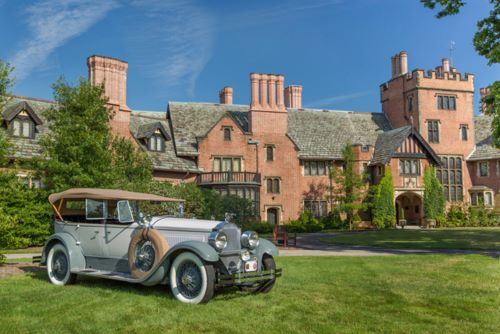
In the first wave, the wealthy asked their architects to build stone manors replete with Jacobean parapets and oriels (such as Goodyear Tire & Rubber Company co-founder Frank Augustus “F.A.” Seiberling’s “Stan Hewitt” mansion in Akron, Ohio. As the style peaked during the 1920s and ’30s, streetcar suburbs sprouted pitched-roof cottages with masonry veneer and decorative half-timbering, such as the example seen in this design.
In the first wave, the wealthy asked their architects to build stone manors replete with Jacobean parapets and oriels (such as Goodyear Tire & Rubber Company co-founder Frank Augustus “F.A.” Seiberling’s “Stan Hewitt” mansion in Akron, Ohio. As the style peaked during the 1920s and ’30s, streetcar suburbs sprouted pitched-roof cottages with masonry veneer and decorative half-timbering, such as the example seen in this design.
Click the Picture to Return to Meek & Beach Stock Catalog Page

