The 'Stock' Exchange
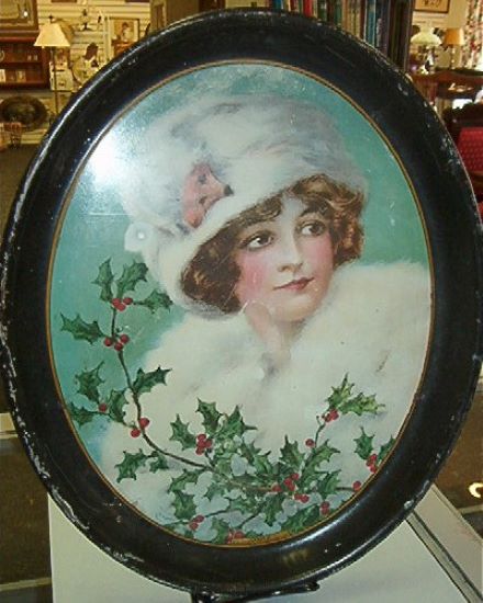
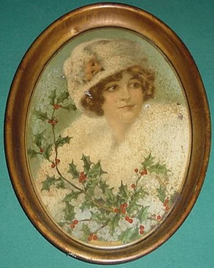
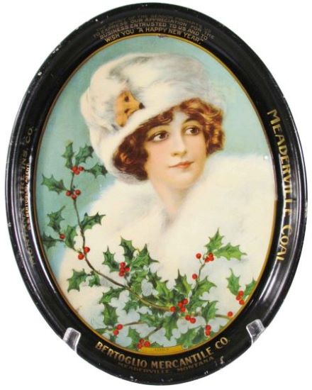
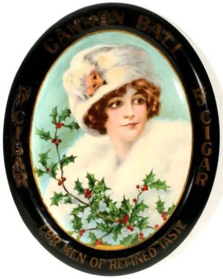
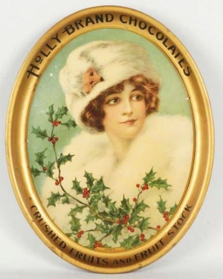
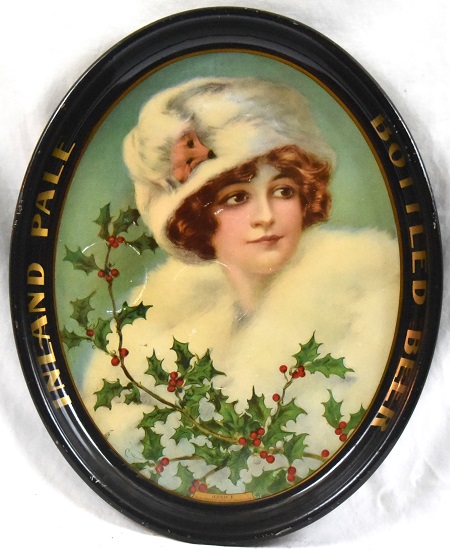
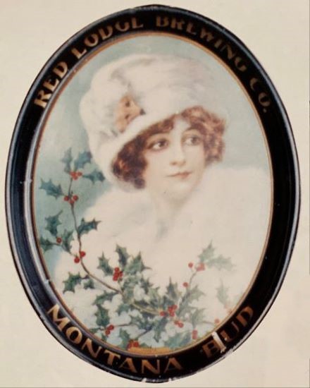
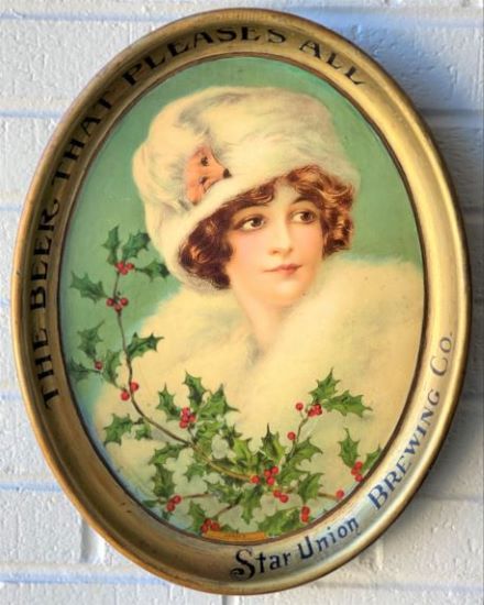
American Art Works: No. 134 "Janice"
American Art Works: No. 134 "Janice"
Date: 1913 to 1917
Size: 12.75" x 16.25"
Type: Pie
Scarcity: Uncommon
Value: $$$ to $$$$
Condition & Brewer Dependent
Size: 12.75" x 16.25"
Type: Pie
Scarcity: Uncommon
Value: $$$ to $$$$
Condition & Brewer Dependent


General Comments
Aside from the early allegorical trays depicting Primavera (No.23) and Demeter (No.24) this may be the only design to explicitly indicate a specific season by her attire. It’s certainly the only design we clearly associate with winter; most of the other designs merely imply spring or summer. For previous designs we’ve often commented on the symbolism of the flowers and their color and while holly has a long history of symbolic meaning dating back to the Celtic Druids in this case we believe it simply signifies the Christmas season.
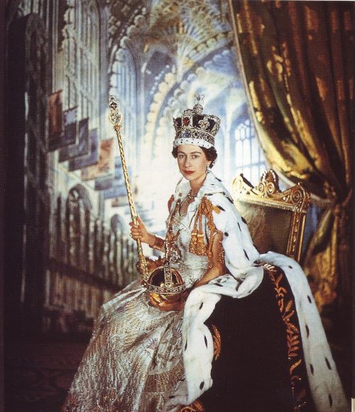
Somewhat surprisingly given all the well dressed and fashionable “pretty ladies” depicted throughout the catalogue, Janice is the only one sporting fur of any sort that we are able to determine. Furs have a long history in fashion, initially being associated with royalty in Europe as seen in this picture of Queen Elizabeth II on her coronation day in 1953
Confirmed Brewer used Stock Trays
Non-Beer Related & Non-Tray Uses

In the 19th century they became associated with wealth and luxury and became increasingly common among the upper middle class. The white fur depicted here is most likely meant to be ermine which is from a small northern weasel species more commonly known as a stoat. The stoat’s normal coat is dark brown, but it turns white during the winter when it is referred to as being “in ermine.” This of course makes it more rare and why it was associated with royalty.
This design was not especially popular with brewers with only a handful of examples. We speculate that this is because winter time was typically the worst sales period for beer according to figures from brewing journals of the day.
There is no Sahling entry for this design, nor have we seen a version with an artist’s signature.
Size, Shape & Advertising Placement
All of the tray examples we’ve seen have been oval, although with steeper rims and slightly smaller dimensions than earlier ovals. This is the first design to utilize this new, smaller oval shape. We’ve also seen a few sign versions, including one for Red Lodge Brewing who also did a tray version. Rims are black with gold text or somewhat less commonly, gold with black text. We have not seen any examples with advertising on the face. We did encounter a monotone print version on a 1914 calendar but could not make out the advertising text.
Hager & Price
This is another design Hager does not discuss, although he does include it in his date of introduction table (1913) and his catalog. The most common brewery example comes from Star Union Brewery of Peru, IL, which consistently reaches low to mid three figures. Less common breweries, like Inland Brewing of Spokane, WA tend more consistently toward mid-three figures, although a very good example went for over $1,200. Most non-brewery examples are in upper double figures to low triple figures.

Click the Picture to Return to Meek & Beach Stock Catalog Page
