
Stock
--

Acme Ice Cream
Unknown

Lockwood Quality Ice Cream
Utica, NY

The 'Stock' Exchange
American Art Works: No. 141 "Right to the Point"
American Art Works: No. 141 "Right to the Point"
Date: 1914
Size: 12.75" x 16.25"
Type: Pie
Scarcity: Rare
Value: $$$ to $$$$
Condition & Brewer Dependent
Size: 12.75" x 16.25"
Type: Pie
Scarcity: Rare
Value: $$$ to $$$$
Condition & Brewer Dependent

Fink Brewing Co.
Harrisburg, PA

E. Porter Brewing Co.
Joliet, IL


General
Continuing an odd trend that pops up occasionally, No. 141 "Right to the Point" is the second design with this title (No. 122 is the first featuring hunting dogs at the ready). No. 141 is also the second design featuring a trompe l’oiel illusion; much like “The Connoisseur” (No. 138) the woman’s dress is the same color as the background, and it is her white scarf or collar that implies where her body is. Her attire is more causal than what we have seen in previous designs, a shift that happen in response to the outbreak of World War I in July 1914 which threw the fashion world into chaos. Since men went off to war, the women were left at home to work in the factories. Over time their hemlines began to get higher, because of the shortages in fabric. Hats were left off to enjoy the shorter hair style, and the jackets were getting shorter. In general, after the men left for the war, women started to wear clothing more comfortable and suited for factory work.
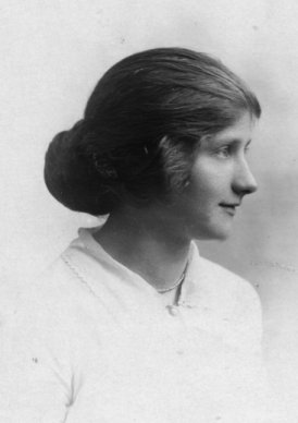
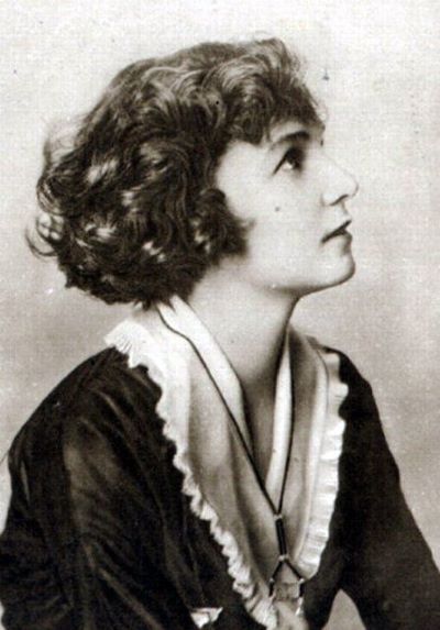
Women also started to do things differently with their hair. Some wore it loose in a low chignon (below left) others ringlets with broad bows, and finally some bobbed their hair (below right), a style that was brought to the US from Paris. The Bob hairstyle is a distinct departure from the elaborate styles of the Edwardian age. Although the bob style saw its initial heyday in the 1920s, in earlier years it started to become a viable alternative to the heavy and cumbersome Edwardian styles. Bobs at this time, often donned by younger women, were seen as an act of rebellion. Bob cuts are made by cutting the hair short so that the bottom of the hair lines up and frames the bottom of the face. Short hair was also sometimes cut with bangs or put up with barrettes.
Continuing an odd trend that pops up occasionally, No. 141 "Right to the Point" is the second design with this title (No. 122 is the first featuring hunting dogs at the ready). No. 141 is also the second design featuring a trompe l’oiel illusion; much like “The Connoisseur” (No. 138) the woman’s dress is the same color as the background, and it is her white scarf or collar that implies where her body is. Her attire is more causal than what we have seen in previous designs, a shift that happen in response to the outbreak of World War I in July 1914 which threw the fashion world into chaos. Since men went off to war, the women were left at home to work in the factories. Over time their hemlines began to get higher, because of the shortages in fabric. Hats were left off to enjoy the shorter hair style, and the jackets were getting shorter. In general, after the men left for the war, women started to wear clothing more comfortable and suited for factory work.
Women also started to do things differently with their hair. Some wore it loose in a low chignon (below left) others ringlets with broad bows, and finally some bobbed their hair (below right), a style that was brought to the US from Paris. The Bob hairstyle is a distinct departure from the elaborate styles of the Edwardian age. Although the bob style saw its initial heyday in the 1920s, in earlier years it started to become a viable alternative to the heavy and cumbersome Edwardian styles. Bobs at this time, often donned by younger women, were seen as an act of rebellion. Bob cuts are made by cutting the hair short so that the bottom of the hair lines up and frames the bottom of the face. Short hair was also sometimes cut with bangs or put up with barrettes.
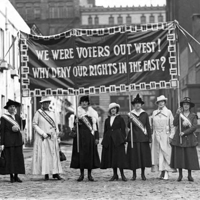
Furthering that theme of rebellion is the subject's direct gaze and her point directly at the viewer, something not seen in previous designs, almost challenging the viewer. This was the era of the final big push for women’s suffrage, which had started as early as the 1840s. There is a long history of event through the mid-to-late 19th century including conventions and the creation of various women’s suffrage organizations involving well-known suffragettes such as Susan B Anthony, Elizabeth Cady Stanton, and many other.
Brewers and distillers, typically rooted in the German American community, opposed women's suffrage, fearing—not without justification—that women voters would favor the prohibition of alcoholic beverages. During the 1896 election, woman suffrage and prohibition stood together, and this was brought to the attention of those who opposed both woman suffrage and prohibition. German Lutherans and German Catholics typically opposed prohibition and woman suffrage; they favored paternalistic families with the husband deciding the family position on public affairs.
Their opposition to women's suffrage was subsequently used as an argument in favor of suffrage when German Americans became pariahs during World War I. Some other businesses, such as southern cotton mills, opposed suffrage because they feared that women voters would support the drive to eliminate child labor. Political machines, such as Tammany Hall in New York City, opposed it because they feared that the addition of female voters would dilute the control they had established over groups of male voters. Resistance was strongest in the east and south, with some western state (Utah and Idaho) granting women the right to vote as early as the 1890s. Women finally gained the right to vote with the passage of the 19th Amendment in 1920.
Their opposition to women's suffrage was subsequently used as an argument in favor of suffrage when German Americans became pariahs during World War I. Some other businesses, such as southern cotton mills, opposed suffrage because they feared that women voters would support the drive to eliminate child labor. Political machines, such as Tammany Hall in New York City, opposed it because they feared that the addition of female voters would dilute the control they had established over groups of male voters. Resistance was strongest in the east and south, with some western state (Utah and Idaho) granting women the right to vote as early as the 1890s. Women finally gained the right to vote with the passage of the 19th Amendment in 1920.
Sahling does not have an entry in his workbook for this design, nor have we ever encountered one with an artist’s signature.
Size, Shape and Message Placement
Every example that we’ve seen of this design has been the new, narrow oval style introduced with No. 134. Most examples have a black rim with gold advertising text, although at least one (E. Porter Brewing) has a gold rim with black text. And at least one example (from Acme Ice Cream) has gold advertising text on the face of the tray.
Hager & Price
Hager stopped commenting on individual trays after No. 136, but he does include it in his date of introduction table and catalog. We’ve only encountered two brewery examples, the aforementioned E. Porter Brewing and Fink Brewing of Harrisburg, PA. Unfortunately, we only have pricing information for the E. Porter example, which was in below average condition, so its hard to draw any broader conclusions. Oddly, most non-brewery examples are in average to below average condition and only realized in the low to mid double figures. Even the very good to excellent examples generally only reach the upper double figures or barely crack the three-figure barrier.
Confirmed Brewer used Stock Trays
Non-Beer Related & Non-Tray Uses
Click the Picture to Return to Meek & Beach Stock Catalog Page

