
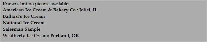
Binghampton Ice Cream
Binghampton, NY

Hoeffler Ice Cream Co.
Unknown

Hossler's Ice Cream
Unknown

Jersey Ice Cream
Unknown

Lake Shore Ice Cream
Unknown

Lockwood Ice Cream
Utica, NY
The 'Stock' Exchange
American Art Works: No. 144 "Everybody's Favorite"
American Art Works: No. 144 "Everybody's Favorite"
Date: 1915 to 1920
Size: 12.75" x 16.25"
Type: Pie
Scarcity: Uncommon
Value: $$ to $$$
Condition & Brewer Dependent
Size: 12.75" x 16.25"
Type: Pie
Scarcity: Uncommon
Value: $$ to $$$
Condition & Brewer Dependent
General Comments
While borrowing some of the illusionary approach present in No. 138 and No. 141, this design does not quite qualify as a trompe l’oiel; she just fades into background color below the shoulder, and it is not clear if it is her other hand or a table that is holding the dish and napkin. The same pyramid mound shape to the ice cream (which appears to be vanilla again) is also evident. The Binghamton tip tray depicts something that looks like a chocolate sauce topping on the ice cream, whereas other examples are plain.
The elaborate, over-the-top hats of the Edwardian age gives way to a simpler style that was mean to compliment the shorter hairstyle that was becoming popular. With the advent of World War I and women moving into occupations previously held by men, fashioned shifted particularly in occupations requiring the wearing of uniforms. A certain military look crept into fashion designs and women wore less jewelry and less lavish clothing.
Some examples of this design bear the signature of artist E.H. Kiefer who did several other designs for Meek or American art works, although none of the rest have proven to be stock designs.
Edwin H Kiefer (1860-1931) born in Port Huron, MI apparently started out with pretentious to be a serious artist. He studied at the Berlin School of Design and from 1895 to 1896 was a student of Jean Paul Laurens and Benjamin Constant at the Academie Julian in Paris.
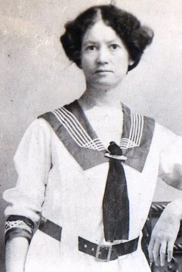
In 1897-1898, he exhibited with at the Paris Salon and at the Chicago Art Institute and in 1913 at the Detroit Institute of Arts. Kiefer is known for portrait, figure, landscape, and genre paintings, which can be found on various websites dedicated to art values. However, he appears to have turned more toward commercial work and may be best remembered for his postcards of Edwardian beauties.

Everybody's Favorite Tip Tray
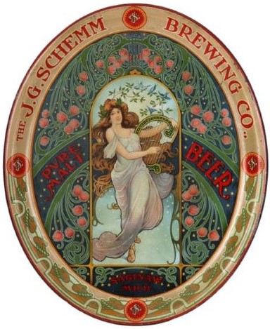

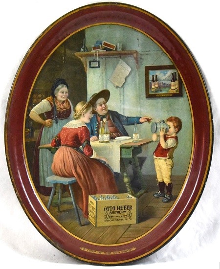
Examples of E.H. Kiefer's work used in brewer trays (J.G. Shemm Brewing Co., Jacob Ruppert and Otto Huber Brewery)
Sahling's Design Notes
Sahling does not have an entry in his workbook for this design and starting in 1915, the notes become fewer and less specific (e.g., May 1915—“Various stock nos.”). Nor have we seen an example with a copyright date, so we are presuming a 1915 date.
Size, Shape and Message Placement
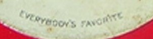
All of the full-sized trays we have seen are the new, narrow oval style with steep rims, which are black with gold advertising text. We have not seen any of these with advertising on the face. Twice we’ve seen tip tray versions of this design, the only one of these later narrow oval trays to appear in a tip version. The tip tray examples have either a red or blue rim, with white text (Binghamton Ice Cream). Another noticible difference between the tip and full size serving tray is the "Everybody's Favorite" tag. For the serving tray it matches the often used fancy gold box, while for the tip trays it is represented in a simple arched font set.
Sahling does not have an entry in his workbook for this design and starting in 1915, the notes become fewer and less specific (e.g., May 1915—“Various stock nos.”). Nor have we seen an example with a copyright date, so we are presuming a 1915 date.
Size, Shape and Message Placement
All of the full-sized trays we have seen are the new, narrow oval style with steep rims, which are black with gold advertising text. We have not seen any of these with advertising on the face. Twice we’ve seen tip tray versions of this design, the only one of these later narrow oval trays to appear in a tip version. The tip tray examples have either a red or blue rim, with white text (Binghamton Ice Cream). Another noticible difference between the tip and full size serving tray is the "Everybody's Favorite" tag. For the serving tray it matches the often used fancy gold box, while for the tip trays it is represented in a simple arched font set.
Serving Tray
Tip Tray

Confirmed Brewer used Stock Trays
Non-Beer Related & Non-Tray Uses
Hager & Price
Hager does not include this design in his date of introduction table or his catalog. The two preceding designs (No. 142-143) he gives as 1915, then he has a gap until No. 149 which he lists as being introduced in 1921. Like No. 143, there are no brewery examples; aside from stock samples they are all ice cream manufacturers. Prices for this design are stronger, in general than they are for No. 143, although none reach more than mid-three figures with most being in the low three figures or upper double figures.
Hager does not include this design in his date of introduction table or his catalog. The two preceding designs (No. 142-143) he gives as 1915, then he has a gap until No. 149 which he lists as being introduced in 1921. Like No. 143, there are no brewery examples; aside from stock samples they are all ice cream manufacturers. Prices for this design are stronger, in general than they are for No. 143, although none reach more than mid-three figures with most being in the low three figures or upper double figures.
Click the Picture to Return to Meek & Beach Stock Catalog Page

