The 'Stock' Exchange
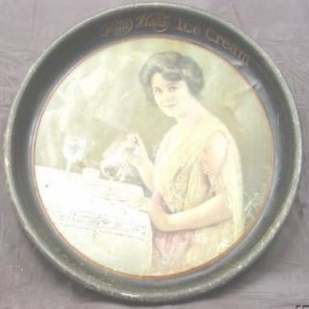
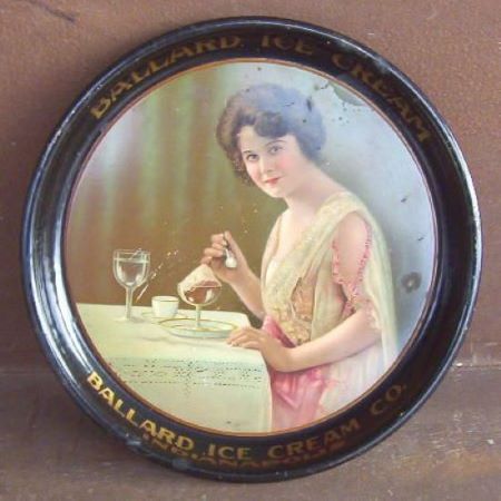
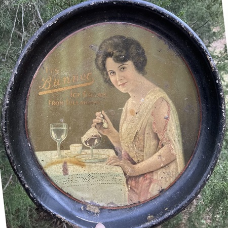
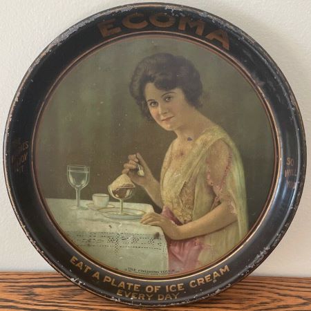
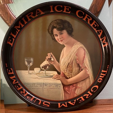
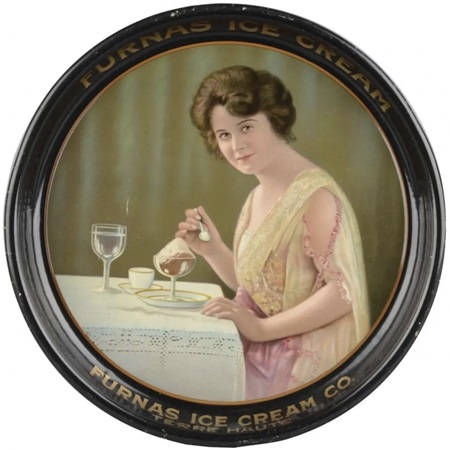
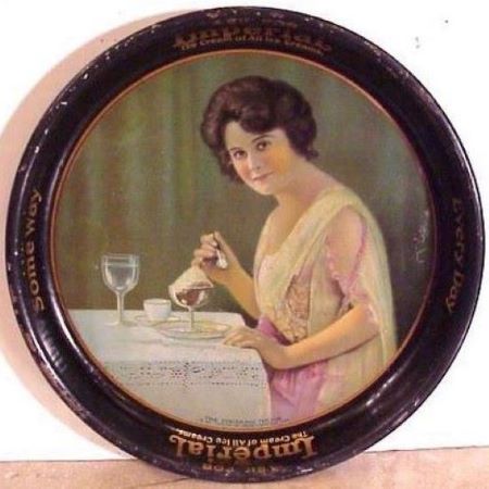
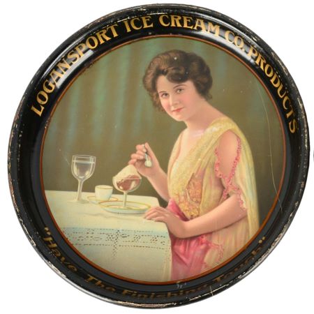
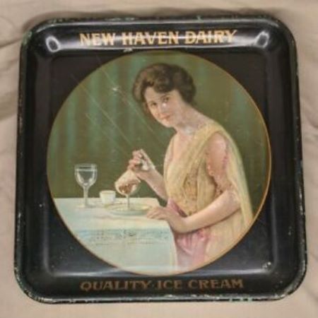
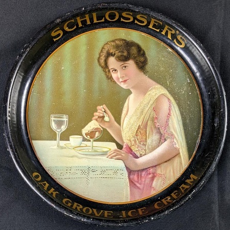
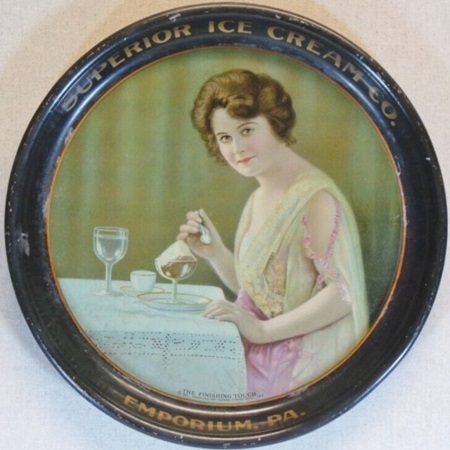
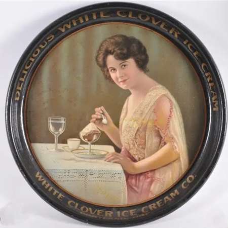
American Art Works: No. 149 "The Finishing Touch"
American Art Works: No. 149 "The Finishing Touch"
Date: 1921 - 1930
Size: 13" & 13.5" x 13.5"
Type: Pie
Scarcity: Common
Value: $$ to $$$
Condition & Brewer Dependent
Size: 13" & 13.5" x 13.5"
Type: Pie
Scarcity: Common
Value: $$ to $$$
Condition & Brewer Dependent

General Comments
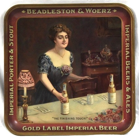
This is one of two trays with the title “The Finishing Touch” that American Art Works produced, the other being a non-stock design done for Beadleston & Woerz. It was far less common for dates to appear on non-stock trays; however, we expect it was done well before this design. Another similarity between the designs is that they both seem to be occurring in relation to a formal event, although the Beadleston & Woerz tray shows the woman preparing for the event, whereas here, the woman seems to be enjoying the final dessert and coffee course.
In this design we are starting to see the recovery of women’s fashion from the deprivation of the war years. The formal eveningwear with lace and embroidery would still have been only available to rich and upper class and would have fit with ostrich feather fans, velvet opera coats and other essentials but still retain the informality and comfort of the war years.

Confirmed Brewer used Stock Trays
Non-Beer Related & Non-Tray Uses
She sports the shorter, more carefree hairstyle that became popularized during the war, which in Victorian and Edwardian times would have been considered unfeminine. By the early 1920s it was becoming empowering as women freed themselves from more traditional roles.
Sahling's Design Notes
Sahling does not have an entry in his workbook for this design; according to notes March 13, 1921, was his last day in the art department before he shifted over to become the foreman of the Display Department. A previous entry in 1919 indicates that in his notes at the end of April 1919 he listed a lot of details for 1918 but everything seems to have been signs and there is no indication of stock designs. For some reason, this design includes the copyright year (1921) in addition to the © symbol and stock number.
Size, Shape and Message Placement
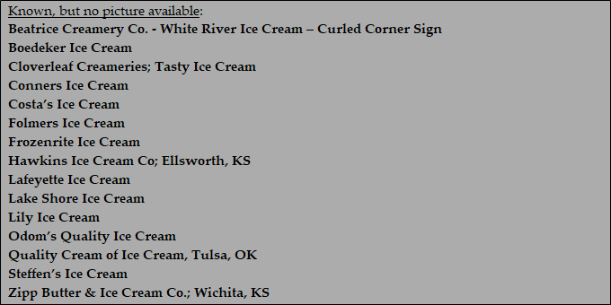
Every example we’ve seen of this design has been a 13” concave pie and for an ice cream company (understandably) with the exception of one square tray (New Haven Dairy) and one curled corner sign for Beatrice Creamery Co (White River Ice Cream) who also did a concave pie tray version. All examples have black rims with gold advertising text. None have featured advertising on the face of the tray.
Hager & Price
Hager stopped commenting on specific trays after No. 136, but he does include this design in his date of introduction table (1921), and he includes it in his catalog with the proper stock number (No. 149). This seems to be the most common of the ten dedicated ice cream design in the catalog and prices tend to reflect that with most examples in the double or low three digits. Exceptionally fine examples reach the lower end of mid-three figures.
Click the Picture to Return to Meek & Beach Stock Catalog Page
