The 'Stock' Exchange
American Art Works: No. 155
American Art Works: No. 155
Date: 1925 - 1930
Size: 13"
Type: Pie
Scarcity: Rare
Value: $$ to $$$
Condition & Brewer Dependent
Size: 13"
Type: Pie
Scarcity: Rare
Value: $$ to $$$
Condition & Brewer Dependent

General Comments
Clearly another design geared toward ice cream manufacturers that was produced during the prohibition era, so not surprisingly there are no brewery examples of this tray. It is the last pure ice cream design in the catalog (No. 156 was initially issued as an ice cream design but revised for use as a beer tray, as discussed further in that profile). Although we have not seen a copyright date on the examples we’ve seen, we believe this design was released later in the prohibition era (i.e., closer to the end of prohibition) given the very limited number of users of the design. The whole concept of stock designs seems to have gotten phased out very quickly after prohibition as breweries started up again. Although there a few proto-stock designs that date from after prohibition they complete disappear by the mid-1930s. Although American Art Works still produced some non-stock ice cream trays this shift away from stock designs by the brewers affected ice cream manufacturers. We speculate that American Art Works was also shifting its focus to metal displays, non-stock items and completely dropped stock offerings.
Clearly another design geared toward ice cream manufacturers that was produced during the prohibition era, so not surprisingly there are no brewery examples of this tray. It is the last pure ice cream design in the catalog (No. 156 was initially issued as an ice cream design but revised for use as a beer tray, as discussed further in that profile). Although we have not seen a copyright date on the examples we’ve seen, we believe this design was released later in the prohibition era (i.e., closer to the end of prohibition) given the very limited number of users of the design. The whole concept of stock designs seems to have gotten phased out very quickly after prohibition as breweries started up again. Although there a few proto-stock designs that date from after prohibition they complete disappear by the mid-1930s. Although American Art Works still produced some non-stock ice cream trays this shift away from stock designs by the brewers affected ice cream manufacturers. We speculate that American Art Works was also shifting its focus to metal displays, non-stock items and completely dropped stock offerings.
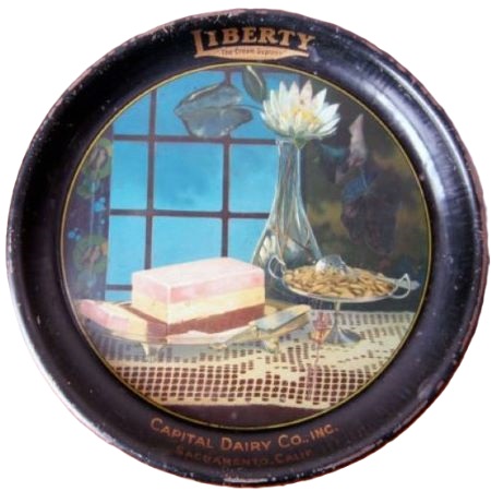
The ice cream depicted is clearly a block of Neapolitan, which is comprised of chocolate, vanilla and strawberry ice cream. Neapolitan ice cream was named in the late 19th century as a reflection of its presumed origins in the cuisine of the Italian city of Naples, and the many Neapolitan immigrants who brought their expertise in frozen desserts with them to the United States. Early recipes used a variety of flavors (as reflected in an earlier example on No. 96, which contains green); however, the number of three molded together was a common denominator, to resemble the Italian flag. More than likely, chocolate, vanilla, and strawberry became the standard for the reason that they were the most popular flavors in the United States at the time of introduction.
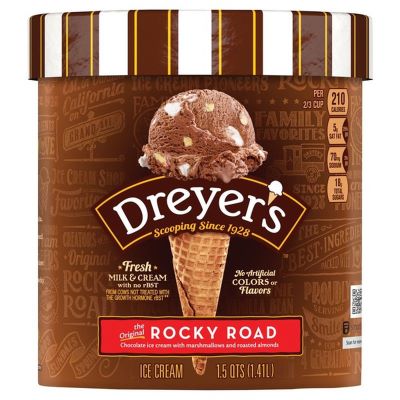
The inclusion of a dish of nuts is interesting; at this early stage of wide-spread ice cream eating in the United States, nuts were not typically included in any of the flavors of the day. They were more likely to be used as a topping. They may have first been introduced in an ice cream flavor in 1929 when Rocky Road was created. There are actually two ice cream makers who claim to have been the first to create and market Rocky Road as we know it today, both of them based out of Oakland, California. One ice cream maker is the Bay Area mini-chain Fentons Creamery, while the other is the by now national maker Dreyer's (aka Edy's on the East Coast). The Fentons story goes that in 1929 the creamery employed a candymaker named George Farren. Farren blended a candy bar containing both nuts and marshmallows into a batch of ice cream, thus inventing not only a brand-new flavor but the whole concept of mix-ins to which Cold Stone Creamery would later owe its existence. It seems that Farren was also friends with two men also in the ice cream and candy business: William Dreyer and Joseph Edy. Dreyer was the ice cream maker and Edy the candymaker and they created their version of Rocky Road (also in 1929) as "something uplifting for their customers" after the stock market crash left the country in such bad shape. Dreyer took big full marshmallows from Edy and cut them up into perfect bite size pieces with his wife's pinking shears, crushed some toasted nuts and mixed them both into his rich chocolate ice cream. Fentons favored walnuts, while Dreyer's used almonds. No matter who invented Rocky Road, it was one of the first ever ice creams with “mix-ins." In a time when the main flavors were vanilla, chocolate, and strawberry, Rocky Road was revolutionary and changed the ice cream world as we know it.
The flower (and associated leaves) in vase appears to be a white lotus, which is a species of water lily. Symbolically, a white lotus symbolizes purity, which was often a focus of ice cream/diary advertising of this era similar to the brewing industry’s Food & Drug Act purity statements in the early years of the 20th century.
A number of elements in the design hint at the emergence of a new artistic style, Art Deco, which was emerging in the later 1920s. One of the characteristics of Art Deco is greater simplicity in design elements, which are reflected in the clean lines of the nut dish, the less delicate and more geometric pattern of the lace tablecloth and the bold colors of the wallpaper and curtain that appear in the background.
This design is the only real example of Art Deco (to a limited degree) in the Meek/American Art Works catalog. Art Deco, which is about angles and geometric patterns, is often described as a reaction to Art Nouveau, which was about curves and flowing lines. Art Deco is more man-made/architectural (The Chrysler Building and other skyscrapers of New York City built during the 1920s and 1930s are monuments of the style.) and Art Nouveau is more beauty and nature. However, we really do not see much Art Nouveau in the stock designs from Tuscarora to American Art Works. Art historians generally date Art Nouveau as ending in the early 20th century and Art Deco being “born” in 1925 at the Exposition internationale des arts décoratifs et industriels modernes (International Exhibition of Modern Decorative and Industrial Arts) held in Paris.
The roughly 25 years in between Art Nouveau and Art Deco was largely occupied by the Edwardian age and World War I which was a transitory period without a distinctive style from an art and design perspective. Edwardian art is born of the results of several artistic revolutionary movements across the era most renowned of which were Fauvism, post-impressionism, cubism, expressionism, futurism. It was also impacted by the constructivism and Dadaism movements. Most paintings and sculptures sought to represent the beauty that nature possessed. Bright floral patterns of rose and lilac also became part of the popular culture. Complex designs were replaced with simpler ones. Paintings started becoming bolder by the day and fresh inspirations arose out of the new era. This movement popularized the trend of making real life natural elements a part of every artwork made in Europe. The aim of this movement was bringing to the common eye the enormous beauty of nature. Paintings started being centered on floral patterns and bold depiction of human forms. This is largely the artistic orientation represented in the stock designs issued by Tuscarora, Meek & Beach, Meek and American Art Works.
Sahling's Design Notes
By this time Sahling had left the Art Department and there are no further entries in his workbook.
Size, Shape and Message Placement
Both examples we’ve seen are 13” concave pies with black rims and gold advertising text. Neither had advertising text on the face of the tray. The sample size is too small to know for certain if this is true of all examples of this design.
Hager & Price
Hager does not have any designs beyond “When Dreams Come True” (No. 150), so this design does not appear in his catalog. Given its scarcity its entirely possible he never encountered it. We have only seen this twice ourselves. The prices realized were surprisingly low; mid-double digits for an average to above average examples.


Confirmed Brewer used Stock Trays
Non-Beer Related & Non-Tray Uses

Click the Picture to Return to Meek & Beach Stock Catalog Page


