
Bluff City Brewing Co.
Alton, IL

Harry F. Bowler Brewery
Amsterdam, NY

Chas. H. Daniels Brewery
Manistee, MI

Elkins Brewing Co.
Elkins, WV

Enterprise Brewing Co.
San Francisco, CA

Joseph Hajicek - Hutchinson Brewing Co.
Hutchinson, MN

Ironwood Brewing Co.
Ironwood, MI

John Kaizmaier, Brewer
Altoona, PA

Leisne & Henes Brewing Co.
Menominee, MI

Mt. Hood Brewing Co.
Portland, OR

Port Washington Brewing Co.
Port Washington, WI

E. Porter Brewing Co.
Joliet, IL

Pure Beer Brewing Co.
Washburn, WI

Roseneck Brewing Co.
Richmond, VA

Ruff Brewing Co.
Quincy, IL

Ruland Brewing Co.
Barboo, WI

Thomas Ryan's Consumers Brewing Co.
Syracuse, NY

Thomas Ryan's Commercial Brewing Co.
Syracuse, NY

Schreihart Brewing Co.
Manitowoc, WI

Standard Brewing Co.
Scranton, PA

Star Union Brewing Co.
Peru, IL

Union Brewing & Malting Co.
San Franciso, CA
The 'Stock' Exchange
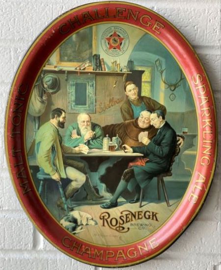
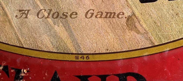
Meek & Beach Co. No. 46 "A Close Game"
Meek & Beach Co. No. 46 "A Close Game"
Date: 1903 - 1906
Size: 13.5" x 16.5"
Type: Inverted Pie
Scarcity: Fairly Common
Value: $$$ to $$$$
Condition & Brewer Dependent
Size: 13.5" x 16.5"
Type: Inverted Pie
Scarcity: Fairly Common
Value: $$$ to $$$$
Condition & Brewer Dependent

Ike Berney Store
Unknown

Kobolt's Family Liquor Store
Philadelphia, PA

Cornelius Rohles - Bottler
Philadelphia, PA

Stock
--

Black Hills Brewing Co.
Central City, SD

Deer Park Brewing Co.
Port Jervis, NY

Standard Brewing Co.
Scranton, PA

Union Brewing & Malting Co. TOC
San Francisco, CA

White Swan Laundry
Unknown


General
This design shows up bearing both M&B and Meek & Co “signatures” indicating that it spanned the name change in late 1904/early 1905. Given that it precedes the Teddy Roosevelt design (No. 47) which J.F. Meek specifically referenced in his 1903 interview in Printer’s Ink, clearly this design was in the catalog for at least a couple of years. This is bolstered by the fact that its fairly common with a diverse number of different advertising issuers (mainly brewers, but there are non-brewer examples too). This is the first design (discounting Mr. John Mitchell) to have a title printed on the tray. In this case, “A Close Game” appears at the bottom of the image in faded black text.
The design features some tropes that were standard in breweriana of the era, including a couple of monks, an outdoorsman/hunter/mountaineer and a tavern setting. We have not encountered an example with an artist signature, although it would not be a complete surprise to learn this image had been acquired by J.F. Meek on one of his European buying trips. It’s also possible it was produced in-house, as there is ample evidence (which we will introduce when we get to tray No. 59) that M&B artists were creating original works.
We have not encountered any significant variations among the different issuers, other than the inclusion by some of them (Rosenegk, Star Union, Thomas Ryan) or a crest or logo above the mantel behind the figures.
Shape & Rim & Ad Text
No. 46 is a standard portrait-oriented oval with the low pie shaped rim and rolled edge. All of the examples we’ve seen sport plain, dark red rims and carry either gold or black advertising text. Some do carry secondary advertising text on the image, but these are the minority. We have also encountered a few TOC sign versions with an oval image surrounded by faux woodgrain and gold text.
Hager & Price
Hager doesn’t mention this tray, but does include this in his version of the catalog. After No. 1 (Baby Doe Tabor), this is the most common design we’ve seen in the early part of the Tuscarora/M&B part of the catalog. The vast majority of issuers were breweries and prices, while solid, tend to be comparatively reasonable compared to contemporary designs for most breweries with certain exceptions. The prices for the few non-breweries are generally much lower, but interestingly stronger for this design than non-brewery examples of contemporary designs.
Confirmed Brewer used Stock Trays
Non-Beer Related & Non-Tray Uses
Click the Picture to Return to Meek & Beach Stock Catalog Page

