
Cold Spring Brewery
Sudbury, PA

Fredericksburg Brewing Co.
Fredericksburg, CA

Humboldt Brewing Co.
Eureka, CA

Inland Brewing & Malting Co.
Spokane, WA

Union Brewing Co.
Newark, NJ
The 'Stock' Exchange
H.D. Beach Co.: 'Toasting Girl'
H.D. Beach Co.: 'Toasting Girl'
Date: 1908
Size: 13" Pie
12" SS Dish
Scarcity: Rare
Value: $$$ to $$$$
Condition & Brewer Dependent
Size: 13" Pie
12" SS Dish
Scarcity: Rare
Value: $$$ to $$$$
Condition & Brewer Dependent

S. Ban Co.
Denver, CO


General Comments
Many of the “Victorian Lady” trays in the first decade of the 20th century reflect women’s fashion trends, including hair styles. This design is perhaps H.D. Beach’s best “big hair” example and probably represents an exaggerated version of a style often seen in “Gibson Girl” illustrations, which were technically a series of drawings that were featured in LIFE magazine in 1908. Those sketches had a profound impact on the culture of the early 1900's and were intended to portray the modern woman; well-educated, refined, skilled, and independent. These women were generally tall and beautiful, with a luxuriously messy “updo,” like that featured here. Depicting a woman drinking fit with the idea of her being independent in an era where women were typically not permitted in saloons and other drinking establishments (aside from waitresses and “working girls”).
Many of the “Victorian Lady” trays in the first decade of the 20th century reflect women’s fashion trends, including hair styles. This design is perhaps H.D. Beach’s best “big hair” example and probably represents an exaggerated version of a style often seen in “Gibson Girl” illustrations, which were technically a series of drawings that were featured in LIFE magazine in 1908. Those sketches had a profound impact on the culture of the early 1900's and were intended to portray the modern woman; well-educated, refined, skilled, and independent. These women were generally tall and beautiful, with a luxuriously messy “updo,” like that featured here. Depicting a woman drinking fit with the idea of her being independent in an era where women were typically not permitted in saloons and other drinking establishments (aside from waitresses and “working girls”).
Confirmed Brewer used Stock Trays
Non-Beer Related & Non-Tray Uses
Click the Picture to Return to Meek & Beach Stock Catalog Page
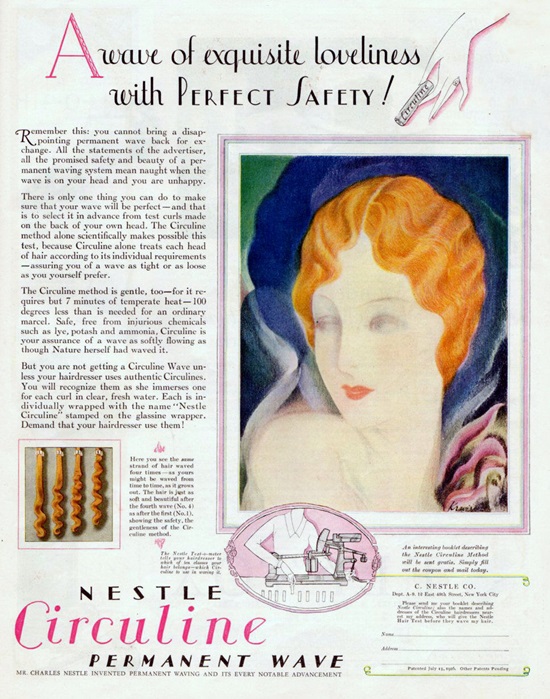
The hairstyle depicted here (typical of the Gibson Girl) is swept back from the face, into a bun or twist, which was linked with the idea of the “New Woman” and implied elegant athleticism (something not particularly associated with women in the 19th century). The large bow in the back of her hair is typical of this era as it was needed to gather and hold large volumes of hair in place. The greater ease with which this style could be achieved was likely in reaction to the previously predominant Nestle Permanent Wave style, which involved 10 hours of chemicals, curlers, and waves. The Gibson Girl style reflected the greater freedom women were seeking in society and achieving through efforts like the Suffragette movement. In a way this was a transitory style that retained the long hair typically associated with women before the emergence of the “bob” in the mid 19-teens and are seen a number of Meek designs.
Like other stock designs of this era there are elements that are meant to suggest upward mobility, including the elaborate dress with decorative lace additions to the neckline and sleeves, gold necklace, and gold bracelet. In addition, she sports an extended pinky on the hand holding the goblet. Today, etiquette experts would consider this a sign of pretentiousness, but in the early 20th century this would still have been considered a sign of refinement (suggesting a well-off and cultured person). The act of sticking out one's pinky finger while drinking is thought to date back to the medieval practice of using it for dipping into spices, such as mustard or salt, while eating. During this time period, eating utensils were not typically used. Rather, food was eaten with the hands, with the pinky fingers being extended out to remain clean so they could be dipped into spices and placed on the tongue. After the 16th century, utensils became commonplace, but the act of extending the pinky finger, particularly while drinking tea, has remained for some as an act of formality. The pink rose she is wearing was meant to represent elegance and femininity.
Like other stock designs of this era there are elements that are meant to suggest upward mobility, including the elaborate dress with decorative lace additions to the neckline and sleeves, gold necklace, and gold bracelet. In addition, she sports an extended pinky on the hand holding the goblet. Today, etiquette experts would consider this a sign of pretentiousness, but in the early 20th century this would still have been considered a sign of refinement (suggesting a well-off and cultured person). The act of sticking out one's pinky finger while drinking is thought to date back to the medieval practice of using it for dipping into spices, such as mustard or salt, while eating. During this time period, eating utensils were not typically used. Rather, food was eaten with the hands, with the pinky fingers being extended out to remain clean so they could be dipped into spices and placed on the tongue. After the 16th century, utensils became commonplace, but the act of extending the pinky finger, particularly while drinking tea, has remained for some as an act of formality. The pink rose she is wearing was meant to represent elegance and femininity.

Gibson Girl
Nestle Permanent Wave
We have never seen an example with artist attribution, suggesting it was likely an in-house artist who worked for Beach. Not surprisingly most examples are from breweries, possibly including the August Wolfert example from Elizabeth, NJ. We deduce this from expression (in German, possibly from a drinking song) on the glass which translates as “Without girls, beer and wine, you can’t have a very good time.” The one exception may be the S. Ban example from Denver, which appears to have been a Japanese mercantile store established by Shinzaburo Ban who was primarily known as a contractor of Japanese laborers for the railroads. Ban also established some Japanese stores, presumably to cater to these same laborers; he is known to have opened a branch in Denver, CO.

Size, Shape and Message Placement
We’ve encountered examples as 12” straight-sided dishes and 13” convex pies. Most feature a red rim, although Union Brewing of Newark’s is black. The primary advertising text appears on the rim in either black, gold, or white highlighted by gold. The Tivoli Select Lager example from Fredericksburg Brewing of San Jose, CA is especially elaborate with different text colors on the upper versus lower rim and added curli-cue embellishment surrounding the small logos at the 3 and 9 o’clock positions. Several examples feature secondary ad text on the goblet she is holding in either white, black, or gold text.
Hager & Price
We’ve only seen a handful of these over the years with examples from Inland Brewing occurring most often. The brewery examples in better than average shape tend toward mid-triple figures with poorer condition examples in the low triple figures. Stock examples run mid-to-upper double figures. To date, the highest price we’ve seen was for a very nice example from S Ban Company, which went in the low four figures.
Shinzaburo Ban

