Fresno Brewing Co.
Fresno, CA

The 'Stock' Exchange
Standard Advertising Co.
Standard Advertising Co.
Date: 1890 - 1901
Size: 16.5" x 13.5"
Type: Inverted Pie
Scarcity: Extremely Rare
Value: $$$$
Condition & Brewer Dependent
Size: 16.5" x 13.5"
Type: Inverted Pie
Scarcity: Extremely Rare
Value: $$$$
Condition & Brewer Dependent

Stock
--

Great Seal Laxatives
Unknown

Widmer & Kloker Liquor Dealers
St. Louis, MO
Click the Picture to Return to Meek & Beach Stock Catalog Page


General Comments
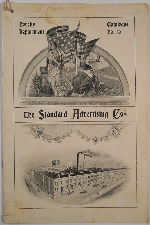
This is the only pre-catalog stock design from Standard Advertising Co. that we are aware of. Although we have seen an early Standard Advertising catalogue Novelty Department No. 10 from 1900, we only saw excerpt pages, none of which featured trays, so unfortunately, we don’t have insight into how Standard advertised their stock trays or priced them. The next catalogue, No. 12, was slated to be released February 1901; we wonder if it was ever produced or was overcome by the events of the merger with Tuscarora.
Unlike the early pre-catalogue Tuscarora designs (with the exception of T-1, “Health & Beauty”) this design carries a clear manufacturer’s mark from Standard Advertising. The “sunburst” design on the face was popular in early tray designs and provided a good background for advertising text.
The one quarter profile of the woman suggests she was not intended to represent a particular woman (i.e., a famous singer or actress), but rather the generic idea. Overall, this seems more like a “design” than an artwork, so it is not a surprise that we’ve never found an example with an artist’s signature.
Since we don’t have information from a catalog or other sources, we don’t have any first-hand confirmation of the number of printings (i.e., the number of times the manufacturer had to apply different colors/shadings) a Standard (and later H.D. Beach, Standard’s successor) tray might typically have. The complexity of the rim and the border around the inset, and the woman herself, suggests it was similar to the nine or ten that seem to have been standard for cross-town competitor Tuscarora. An article profiling the H D Beach company in the Coshocton Age from March 1904 seems to confirm this:

Confirmed Brewer used Stock Trays
Non-Beer Related & Non-Tray Uses
In some cases there are eleven or twelve and even more colors on a single sign and each tray has to be run through the presses from fifteen to twenty times. The tray must pass through the presses for each color on the sign and about five times in addition.
Size, Shape and Message Placement
We have only seen a few examples of this design, all of which have been oval trays. They do not have the two-step rim with a short initial wall that transitions into a concave section and then finally into a wide, flat edge that the pre-catalog Tuscarora trays had, indicating Standard had different stamping machines. All examples have an ornate rim similar to rim designs on early non-stock Standard trays, which did not lend itself to advertising placement. Advertising text appears on the face of the tray, ranging from simple black text (Widmer & Kloker) to more elaborate printings, such as Fresno Brewing’s mix of solid black secondary text and highlighted gold primary text.
We have only seen a few examples of this design, all of which have been oval trays. They do not have the two-step rim with a short initial wall that transitions into a concave section and then finally into a wide, flat edge that the pre-catalog Tuscarora trays had, indicating Standard had different stamping machines. All examples have an ornate rim similar to rim designs on early non-stock Standard trays, which did not lend itself to advertising placement. Advertising text appears on the face of the tray, ranging from simple black text (Widmer & Kloker) to more elaborate printings, such as Fresno Brewing’s mix of solid black secondary text and highlighted gold primary text.
Hager & Price
Although Hager has some early, pre-catalog stock designs in his article, this is not one of them. When we encountered the Fresno Brewing and stock samples, they were not in a sales context, so we don’t have pricing for them. It’s hard to draw much conclusion from the other two, given significant condition differences, but the Prune Laxative (a somewhat better than average example) went for mid-triple figures.
Although Hager has some early, pre-catalog stock designs in his article, this is not one of them. When we encountered the Fresno Brewing and stock samples, they were not in a sales context, so we don’t have pricing for them. It’s hard to draw much conclusion from the other two, given significant condition differences, but the Prune Laxative (a somewhat better than average example) went for mid-triple figures.