
American Brewing Co.
Peru, IL

Bavarian Brewing Co.
Covington, KY

George Doehne Brewery
Harrisburg, PA

Dotterwich Brewing Co.
Dunkirk, NY

Henning Brewing Co.
Mendota, IL

Punxsutawney Brewing Co.
Punxsutawney, PA

Voigt Brewery Co.
Detroit, MI
The 'Stock' Exchange
The Meek Co.: No. 94 "Japanese Iris"
The Meek Co.: No. 94 "Japanese Iris"
Date: 1908 - 1910
Size: 13.5" x 13.5"
Type: Pie
Scarcity: Uncommon
Value: $$ to $$$$
Condition & Brewer Dependent
Size: 13.5" x 13.5"
Type: Pie
Scarcity: Uncommon
Value: $$ to $$$$
Condition & Brewer Dependent

Dufaud Wine & Liquor Co.
Minneapolis, MN

J.M. Schwoyer & Co. - Whiskey
Allentown, PA



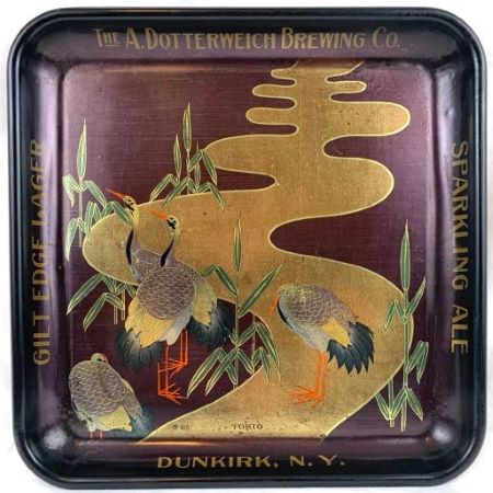
108 "Tokio"
94 "Japanese Iris"

General
No. 94 is a bit of a conundrum: fairly scarce but lacks much value based on sales prices we’ve tracked. It is kind of odd from a design perspective too; there are two inset windows or tile with a japaned, or lacquerware look, similar to No. 59 and No. 83, although here more colors are used. One is of the aforementioned irises and the other of a seemingly unrelated lake scene with a sail boat and tent-like structure. The best explanation we can find for this seemingly odd juxtaposition is that the cultivation of Iris ensata was first noted in literature more than five hundred years ago in Japan. Native to eastern China, Siberia, Korea, and throughout Japan, they are found growing in damp areas near streams, ponds, lakes, and marshes. The selective breeding of the species that commenced in the 1800s produced the foundation of the modern Japanese iris. Our conclusion is that the lake represents a typical environment where irises would be grown, and the tent-like structure might be where the farmer or field hand either stayed or processed harvested flowers. One wonders if this would have been common knowledge in early 20th century America.
These windows or inset are presented on a kind of coppery-colored field that extends almost to the edge of the tray, whereas most stop at the beginning of the rim. As a consequence, the gold advertising text does not show up particularly well. We cannot recall an example where the advertising text appears on the face of the tray (where it likely wouldn’t show up well either).
Sahling has an entry in his workbook for “stock Japanese tray, square No. 94” in July 1908 and then in December 1908 another entry appears for “Stock tray Japanese Iris.” This second entry appears after entries for stock designs No. 95, No. 99, No. 98, and No. 96. Up until 1908 stock designs had appeared fairly chronologically in his workbook; however, in 1908 they become less sequential. The written record doesn’t provide us with any clues as to why this might be; however, we do know that Jasper Meek retired from the company in 1908 due to health concerns and new management under the leadership of C B McCoy took over the company. Perhaps this had something to do with the somewhat chaotic stock design sequence in this timeframe.
Shape & Rim & Advertising Placement
All examples of No. 94 that we have seen are square trays. We have never seen any other shape or size (such as tip trays), nor as a sign. As noted above, advertising text appears in gold and only on the rims.
Hager & Price
Hager does discuss this design in The Question Marks subsection but doesn’t include it in his catalog, apparently because he had not encountered one with a stock number. He notes that it “could belong in the area where the square trays are present, but it has an earlier copyright date.” We take this to be referring to somewhere in the sequence from No. 99 through No. 105 because of the reference to an earlier copyright date, although there are a few earlier square designs (No. 89-No. 93) Oddly given the less than stellar prices for this design, the vast majority of issuers were breweries, although admittedly most of those examples we have seen have been in just good or slightly better than good condition. The most common brewery to show up seems to be American Brewing of Pekin. There does not seem to be much difference in brewery vs non-brewery prices with one or two exceptions.
No. 94 is a bit of a conundrum: fairly scarce but lacks much value based on sales prices we’ve tracked. It is kind of odd from a design perspective too; there are two inset windows or tile with a japaned, or lacquerware look, similar to No. 59 and No. 83, although here more colors are used. One is of the aforementioned irises and the other of a seemingly unrelated lake scene with a sail boat and tent-like structure. The best explanation we can find for this seemingly odd juxtaposition is that the cultivation of Iris ensata was first noted in literature more than five hundred years ago in Japan. Native to eastern China, Siberia, Korea, and throughout Japan, they are found growing in damp areas near streams, ponds, lakes, and marshes. The selective breeding of the species that commenced in the 1800s produced the foundation of the modern Japanese iris. Our conclusion is that the lake represents a typical environment where irises would be grown, and the tent-like structure might be where the farmer or field hand either stayed or processed harvested flowers. One wonders if this would have been common knowledge in early 20th century America.
These windows or inset are presented on a kind of coppery-colored field that extends almost to the edge of the tray, whereas most stop at the beginning of the rim. As a consequence, the gold advertising text does not show up particularly well. We cannot recall an example where the advertising text appears on the face of the tray (where it likely wouldn’t show up well either).
Sahling has an entry in his workbook for “stock Japanese tray, square No. 94” in July 1908 and then in December 1908 another entry appears for “Stock tray Japanese Iris.” This second entry appears after entries for stock designs No. 95, No. 99, No. 98, and No. 96. Up until 1908 stock designs had appeared fairly chronologically in his workbook; however, in 1908 they become less sequential. The written record doesn’t provide us with any clues as to why this might be; however, we do know that Jasper Meek retired from the company in 1908 due to health concerns and new management under the leadership of C B McCoy took over the company. Perhaps this had something to do with the somewhat chaotic stock design sequence in this timeframe.
Shape & Rim & Advertising Placement
All examples of No. 94 that we have seen are square trays. We have never seen any other shape or size (such as tip trays), nor as a sign. As noted above, advertising text appears in gold and only on the rims.
Hager & Price
Hager does discuss this design in The Question Marks subsection but doesn’t include it in his catalog, apparently because he had not encountered one with a stock number. He notes that it “could belong in the area where the square trays are present, but it has an earlier copyright date.” We take this to be referring to somewhere in the sequence from No. 99 through No. 105 because of the reference to an earlier copyright date, although there are a few earlier square designs (No. 89-No. 93) Oddly given the less than stellar prices for this design, the vast majority of issuers were breweries, although admittedly most of those examples we have seen have been in just good or slightly better than good condition. The most common brewery to show up seems to be American Brewing of Pekin. There does not seem to be much difference in brewery vs non-brewery prices with one or two exceptions.
Confirmed Brewer used Stock Trays
Non-Beer Related & Non-Tray Uses

Click the Picture to Return to Meek & Beach Stock Catalog Page

